
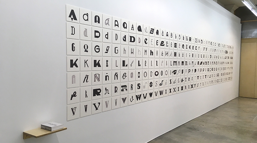
Juan Nava is a designer who does his own, From his corner, Out of focus, fleeing complications although it often ends up in them. In the first typography congress held in Valencia in 2004 compiled a booklet of typographic itineraries that took you through the most interesting old commercial signs in the city and since then has not stopped photograph Recovered letters, A first website, An Instagram account later and a book edited by Grate finally. And the thing does not end there, from 1 July will also be an exhibition in the Drawing Cabinet, Letters. Found, recovered, Drawed, a small tour that ends with 279 Lyrics arranged in panels taken from the hundreds of labels that in recent years have cleaned and resignified drawing its black and white types, No noise around. The naked lyrics. Hero. Majestic.
To talk about Letters We went with Juan Nava to lunch to the JM, mythical bar of his childhood neighborhood. With the olive plate in front, he explained that the sample starts with the word "letters" drawn and painted in the same showcase of the gallery. The "L" drawn by lodging, the following little by little more profiled and the “S” vectorized, an advance of what we will find inside: A brief history of the evolution of graphic design. It begins showing some original letters made by him - who scolds with a little shame—, Drawn with roting between the seventies and eighties within logos and anagrams. "No one is going to find out what they are handmade, Only if you look at the travele shows that they are stuffed with brush, But with gallery lighting it will seem that they are printed ”. Absolute perfection, A barbarity! "It wasn't a barbarity, It was what there was, I had no more or less merit ", corrects us. Before, The labelistas had to draw the letters and he, When he made a logo, Most of the time he also designed the lyrics. "Now, Students who see a sketch of painted and labeled letters are crossed by cables, They don't understand anything ". Nor do they need, no? “No, But it is design history. I hugged my computer now, Don't take it off, But before the computer there was also life, And it was fascinating ". Someone says that, In the first advertising agency for which he worked, They brought the texts mounted with mobile types that printed in a test machine. And what did you do with that? “The ridiculous, Because you just never sucked. You went to the amplifier to get the size you wanted, But the line spacing, Sometimes you had to square it cut line by line, separating them, focusing them ... some photocomposition houses had no more than six types of font, SIX. The theme was very precarious. To do something original, life had to be sought ".
We entered the theme of the signs when we reach the bottom of the gallery. Half -lost signs due to the deterioration of the years that Nava has drawn again in a neutral plane, No colors, so that the lyrics charge a new life. Like that of the old pepe fish that guard in the Cooperativa del Mar because, They are, They have known how to value the past of their Russafa premises and the design that distinguished it. In the book Recovered letters edited by Grate More than two thousand letters from the more than 200 Localized labels, photitalized and digitized over six years. In some cases, Nava has tried to complete the alphabet of some typography, A challenge because it usually has a few letters drawn, The rest, With their numbers and their signs, You have to take them out of the hat. Fourte, Maybe when you retire at all ... part of the project, points, It is to claim that "a lot of old letters are now the most modern and current". And continue: "I always claim the figure of the patellarists, My project without these professionals, evidently, would not exist ". In some cases they invented the letters, In others they copied them of catalogs and manuals or transformed from them to compose their labels, What photographed and isolated from your facade, They star in the next exhibition stop.
When the squid sandwich comes we are theoretical by asking him about the poor typographic uniformity of the cities currently the very recognized typographer Erik Spiekermann complains. Helvetica reigns, that leaves no room for anyone else. Nava responds: “Before there was a wealth that gave personality to the neighborhoods. Now, With all uniformed, Full of franchises, That wealth is being totally lost ". With some letters, sometimes, "Crowded" the rotaryists, unconsciously, They de facto designed the store logo. "Milagritos parcel wanted to have his personality to differentiate himself from the neighbor", that's why, To get attention, His label was filled with shadows, reliefs and more colorful resources. Designed logos without knowing it.
Is there overabundance of typefaces? “Enric Jardí, Great typographer and student of the subject, Always ask: Are more typefaces need? It is evident that no. Is everything done in art? Neither. You always discover some kid who has turned something around and surprises you. There is also a lot because it would not use anything or contribute anything at all. If the din works for me, So I'm going to complicate life if this typography works? I would dare to say that a high percentage of books are edited with garamond, It has centuries and continues to work. For something it will be ... "
For the Carajillo de Terri Volvemos the look in Valencia. Any purely Valencian typographic characteristic? "I always put a very concrete example. In Sigüenza, Guadalajara, My wife's family people, I have everything photographed and you notice that this label did it the same as this one and this other. Yes, you notice the style of the letter, There is something that has the same firm, But this occurs in a town where there would be not many stretching. But here in Valencia I do not see a common guideline. Being the issue of such entrenched ceramics, there is a lot of label solved with ceramics. But of course, It is not a typology of letter, but the material of the label ". Like the panel of Philips. Better there is no On the laundering street ... "It is hand painted ceramics and has a curiosity, There is an error ". A thousand times Nava had photographed this panel until one day, suddenly, He saw it: The mason that mounted the panel was wrong by placing the tile contained.
What labels you have drawn would take home? "I can't have anything else, I have it full. I brought one of Sigüenza, I didn't stop until I rescued him, The one of the Felix Rodríguez de la Fuente optics, My wife's grandfather. I always highlight the label of the Musical Union of La Paz Street, that now occupies the Alehop store. ¡Brutal! The other day, in front of my noses, The glass panel of a Guillem from Castro was going to the container for which he spent many days to go to the Ivam, One pass. I arrived a few days late ". He is fighting for the Valencia City Council to become aware of the importance of valueing this visual heritage, But for now there are no firm steps to protect the facades that shout. “In Paris you see it,” Nava tells us - a ‘boulangerie’, there, To the beast, absolutely baroque, Host painting, And below there is a boutique or a little hotel. One thing with the other is not at odds. I understand that the new owner wants to have his name and his label, In addition our group also participates in that, Because we make brands and franchises. But if there is no personal awareness that this is a crime, that obviously does not have everyone, And there is no law that protects, The poster goes to the trash ".
Are we aware of the Valencians of the historical and artistic value of the signs that decorate our streets? “In the central market there is a new Super Cuca stop, Of these that sell a bit of everything, Nice house is called, that has the hand painted label signed by a stirr of Madrid ”. But it is very uncommon in Valencia. In Madrid and Barcelona, however, A few young labelists have rescued the techniques to work on glass, With gold or silver bread, AND SUPER CURRADA LETTERS. "They have recovered the trade and are working by hand. And they have task for a tube. But of course, There are lifetime that retain the typical wooden facade where the label and the sides were put, where it was also labeled, and many new stores, either a restaurant or a store, They ask for handmade signs ". So good marrow you have to nava, When you take photos in Madrid, Sometimes he doubts, You have to approach the poster because notice that it is new, But at all it looks like a vinyl. Sometimes, He tells us, Discover the pastiche from the statements, The Gin Tonic should not be very fashionable at the beginning of the last century.
Not long ago Juan kicked the typographic itineraries of his book with the students of the design school and the result was bleak, and 64% of the labels that in 2004 They deserved a visit had already disappeared. Posters are struck that remind us stores and professions of the map such as the sale of wool to weight, the knob or the huevería, And that they are works of art in themselves are their sublime letters painted by hand. Before the plastic labels with machine -cut typographies in light boxes, they took the facades of our shops triumphed the noble art of identifying and beautifying businesses with letters invented hand painted that Juan Nava clean and rescues to return the recognition they deserve.
Letters. Found, recovered, Drawed
Thursday 1/7 to Friday 17/9
Drawing Cabinet. Literate Azorín, 33